The difference in colours found on screens and paper.
Digital colours
Each screen has a unique colour profile. All monitors, computer and phone will display colours slightly different. It is impossible to know if your monitor will match the computer that was used to create the original swatches. The brightness of the screen also impacts the colour. It is extremely difficult to replicate a concrete colour on a computer screen. That is why any swatches online are only a guide due to the variations between colours, rather than an exact depiction.
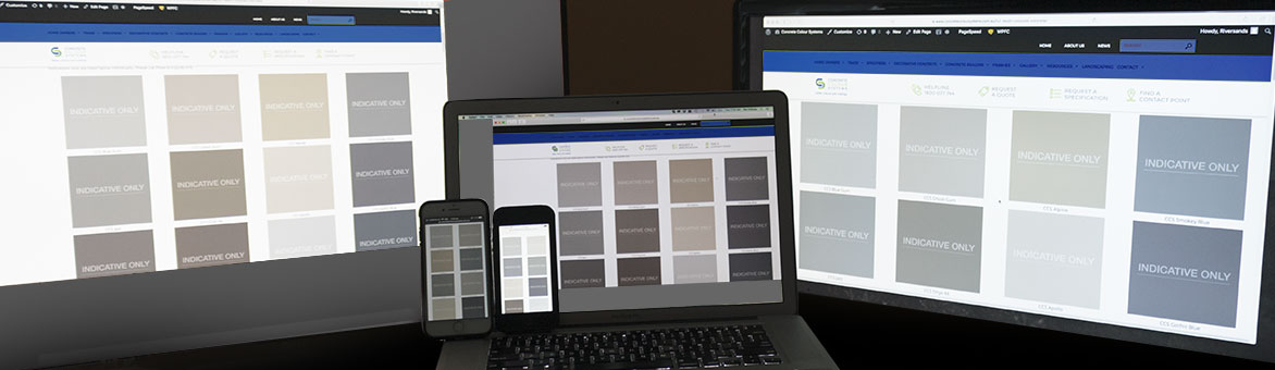
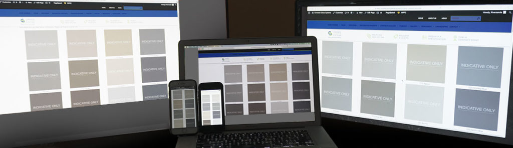
All three monitors and two phones display the exact same page and colour selection from our CCS website colour page. The colours on the two left monitors are distinctly warmer than the colours on the right monitor. As you can see the brightness of the screen is also impacting on how the colours appear.
Different computers, screens, operating systems and even web browsers have different colour characteristics. If you calibrate your display for consistent results, what you see will still differ to other people’s screens.
The effect of light
Below is an example of the different types of indoor lighting and how it can change the appearance of a colour.
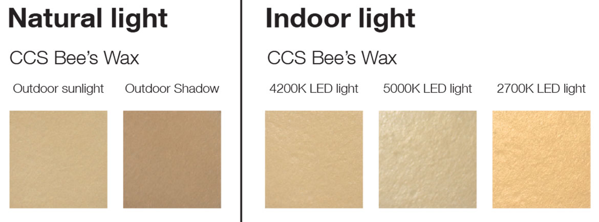
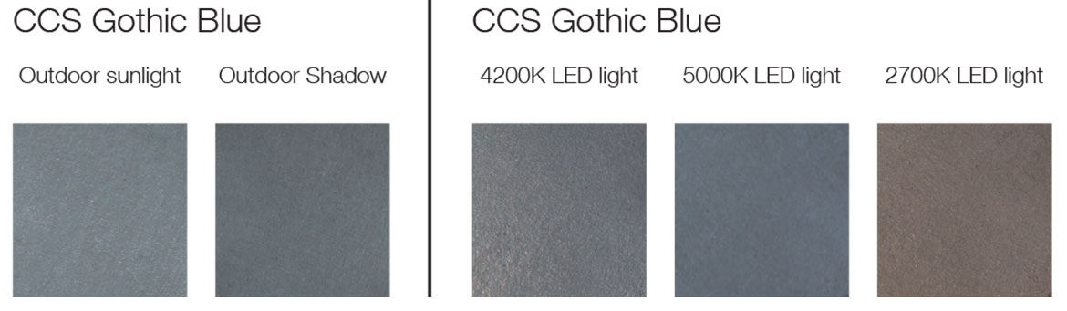
To sum up, the reasons why it is important to check your colours at the project in a site sample:
- Ambient lighting will affect how the colour appears
- Direct sunlight produces a different appearance to indirect light
- Indoor lighting globes can vary in intensity (lux) and colour (kelvin)
Printed colours
Let’s do a quick exercise to see the difference in screens and printing.
- Open a white document on your screens (computer and phone)
- Hold a blank piece of paper next to the screens
The chances of your result showing yellow paper and blue screens is high, as it’s a common result.
This little exercise highlights the white point mismatch. Your screens produce white by setting it to a certain RGB (red, green, blue) number. The paper is dependent on the light illuminating it, though it is also influenced by its own characteristics as well, like brand and finish.
Monitors can display a white that ranges from warm yellow-red tones through to cool blues.
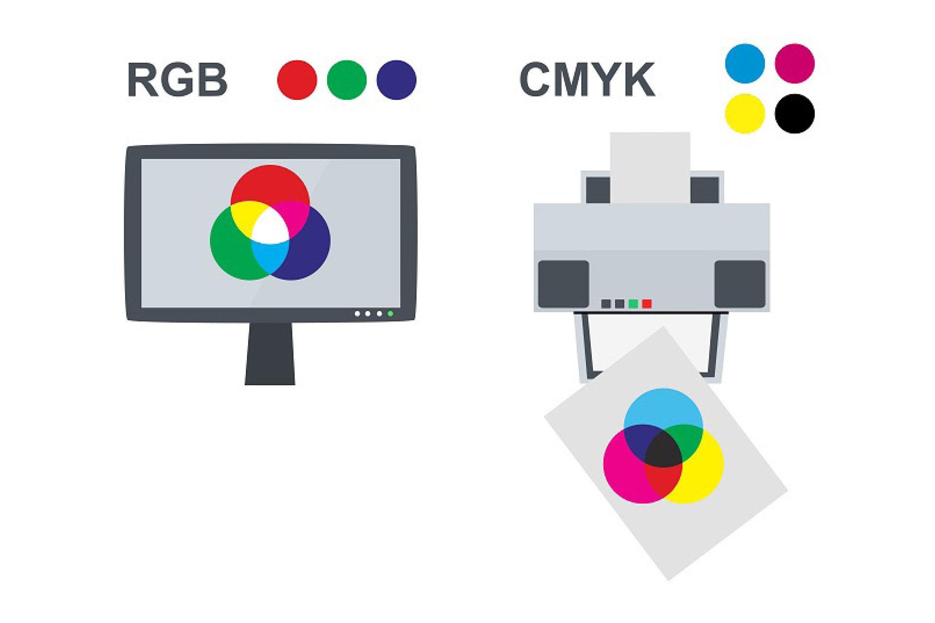
When we consider printing, it uses a different breakdown of colour to produce an image than any screen. Most colours are reproduced using a combination of CMYK (cyan, magenta, yellow and black).
Unfortunately, no matter how careful a printer is, each print run can vary the amount of ink used, the pressure of the plate and the type of paper used. The age of the printed piece will also affect colour reproduction as ink colour will fade over time. Also, the colour that is used to create the printed version will be generated by matching the original concrete colour on a computer monitor (and we know how much variation can occur with screens). Any printed colour swatch should be used as a guide only due to the variation in colours rather than an exact result.
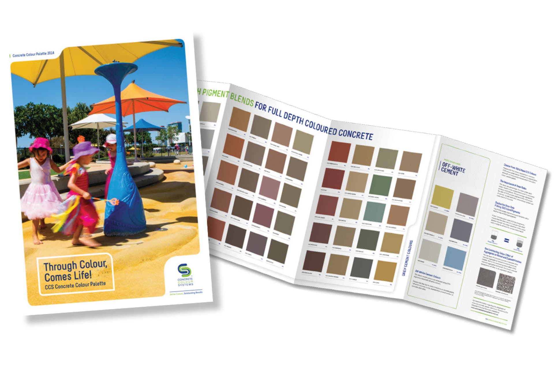
Physical colour
When choosing a colour for your project we strongly recommend you use a physical, true-to-life colour card. The colours within the card are small swatches with genuine colour-matched concrete brushed onto them.
Please get in touch with us via live chat, email or phone 1800 077 744 and we can send you a true-to-life colour card.