Create a design with the Pantone colours of the year.
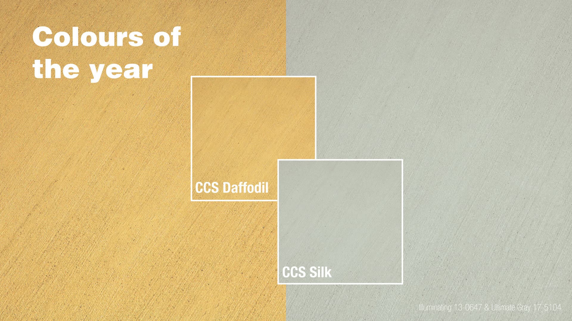
2021 brings new design and colours to our world of home offices and renovations. Chosen to convey strength and hopefulness to follow a year of trials, hardships, and lockdowns; Pantone Ultimate Gray and Illuminating are symbols of endurance and happiness.
CCS Silk and CCS Daffodil bring versatility and brightness to your home or workplace. Learn how to add these colours to your design.
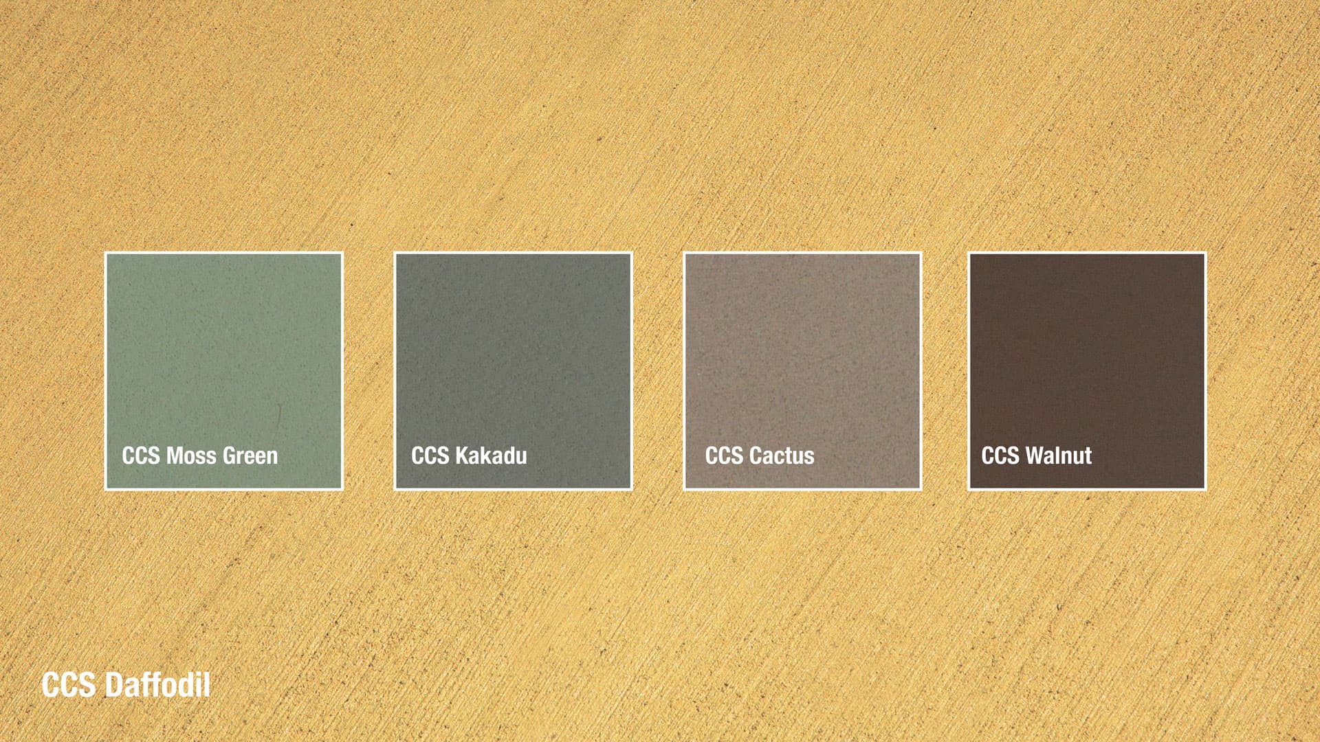
Incorporating CCS Daffodil into your vision will create a happy and bright environment. Yellow is a warm colour and is perfect for south-facing spaces to brighten them up. When it comes to pairing it with other colours, teaming CCS Daffodil with block colours and contrasting hues will really make it shine.
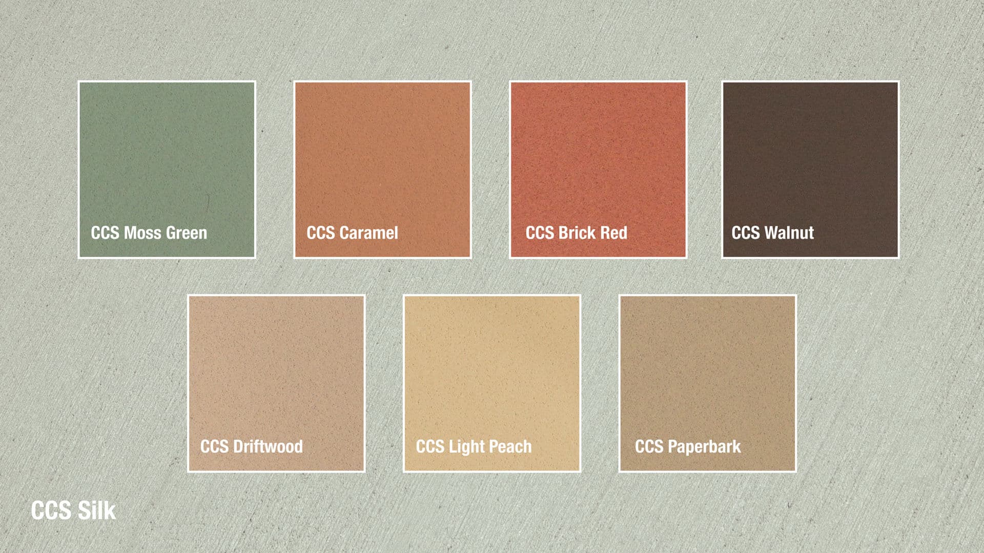
CCS Silk is a neutral grey, making it great for backdrops with stronger contrasting colours. Not a fan of a strong contrast? Team it with softer or pastel tones for a soothing and calming effect. CCS Silk is also great for pairing with natural materials like timber, brick, and stone in salute to our natural environment.
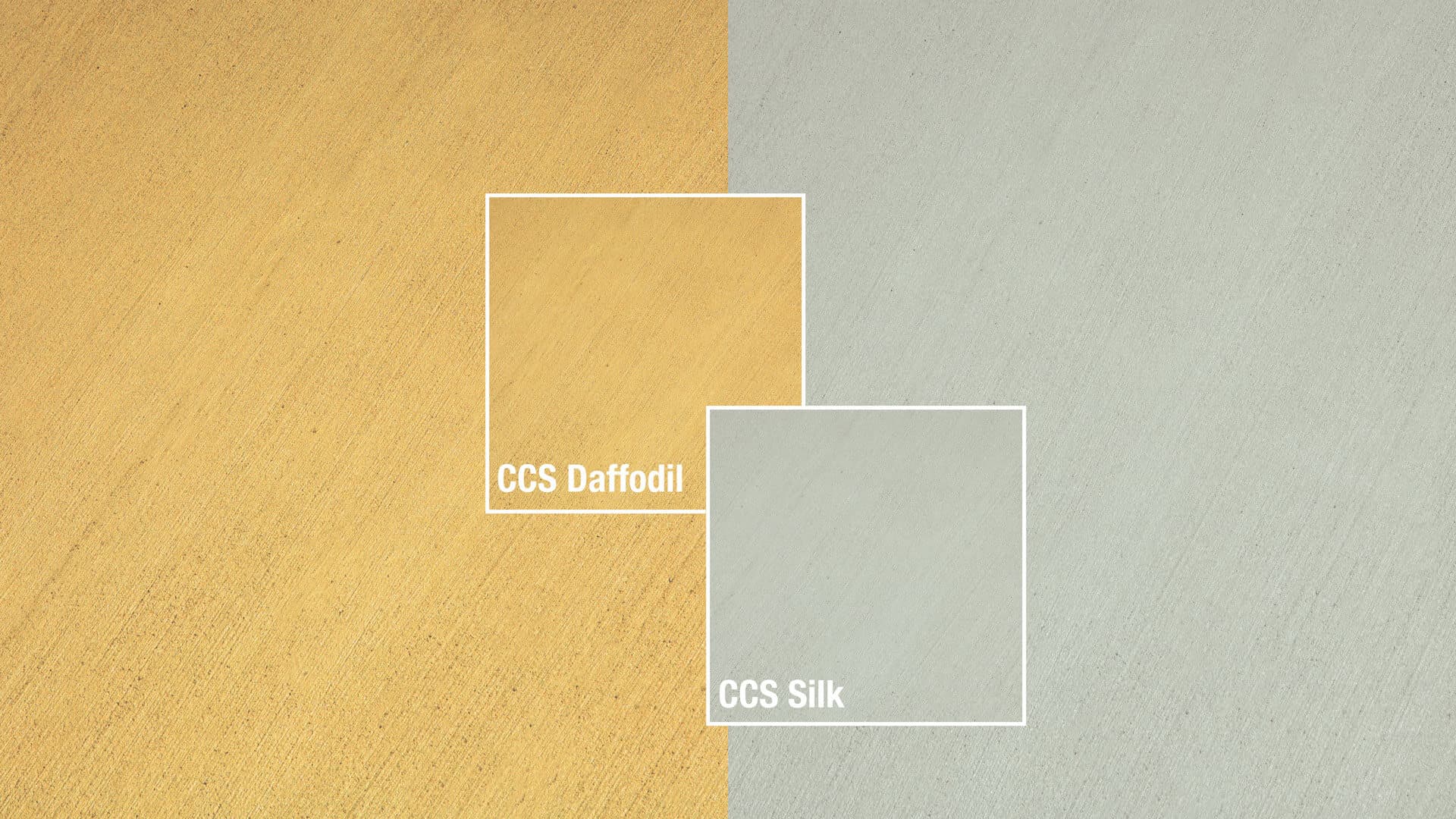
These strong, independent colours can also come together to support each other. When teamed together CCS Silk and CCS Daffodil create a strong and positive design that hints at thoughtfulness with the promise of friendship. It is a colour combination that provides us with resilience and hope.

